The bank’s account of
itself had moved on.
Its pictures stayed
where they were.
A reader meets a
different institution.
Globalance
Globalance Bank AG is an owner-managed Swiss private bank in Zurich. It invests in companies it identifies as future-oriented, publishes a quarterly magazine, and was named Best Swiss Private Bank in the 2026 BILANZ rating.
It came for a direction for its pictures. The pictures were already making an argument, and it was not the one the bank was making in words.
The Symptom
The brief was imagery. Not the positioning, not the website — a direction for the pictures, and the pictures alone.
Pictures get chosen against what they are meant to argue, and nothing in the brief established what that was. So the first work was not selection. It was reading what the bank’s published materials had been arguing on their own, to an audience that had never asked them what they meant.
Everything on this page comes from material the bank publishes and any reader can check.
01Pattern
The homepage carousel runs four slides. The first is a rendered montage led by a green-blue Earth, wind turbines and a solar suburb in the foreground. The second is video: a city crossing seen from directly above, people moving across it, a yellow network drawn between them and moving as they move. The third is the bank’s transparency platform, a green globe at its center. The fourth announces Best Swiss Private Bank 2026 over an aerial photograph of a Swiss town and its parkland.
Two of those argue an institution that allocates capital and can read a system from above. Two argue something smaller and greener. They rotate.
The crossing — the most institutional image on the site, and the only one with a designed system moving inside it — carries the softest line on it: for our planet, for our children, for our future. The hardest credential the bank holds is delivered over trees.
Below the carousel, three tiles in one row: a night interchange under light trails, the platform, and the Matterhorn. The infrastructure, the technology, and the mountain, in the same width.
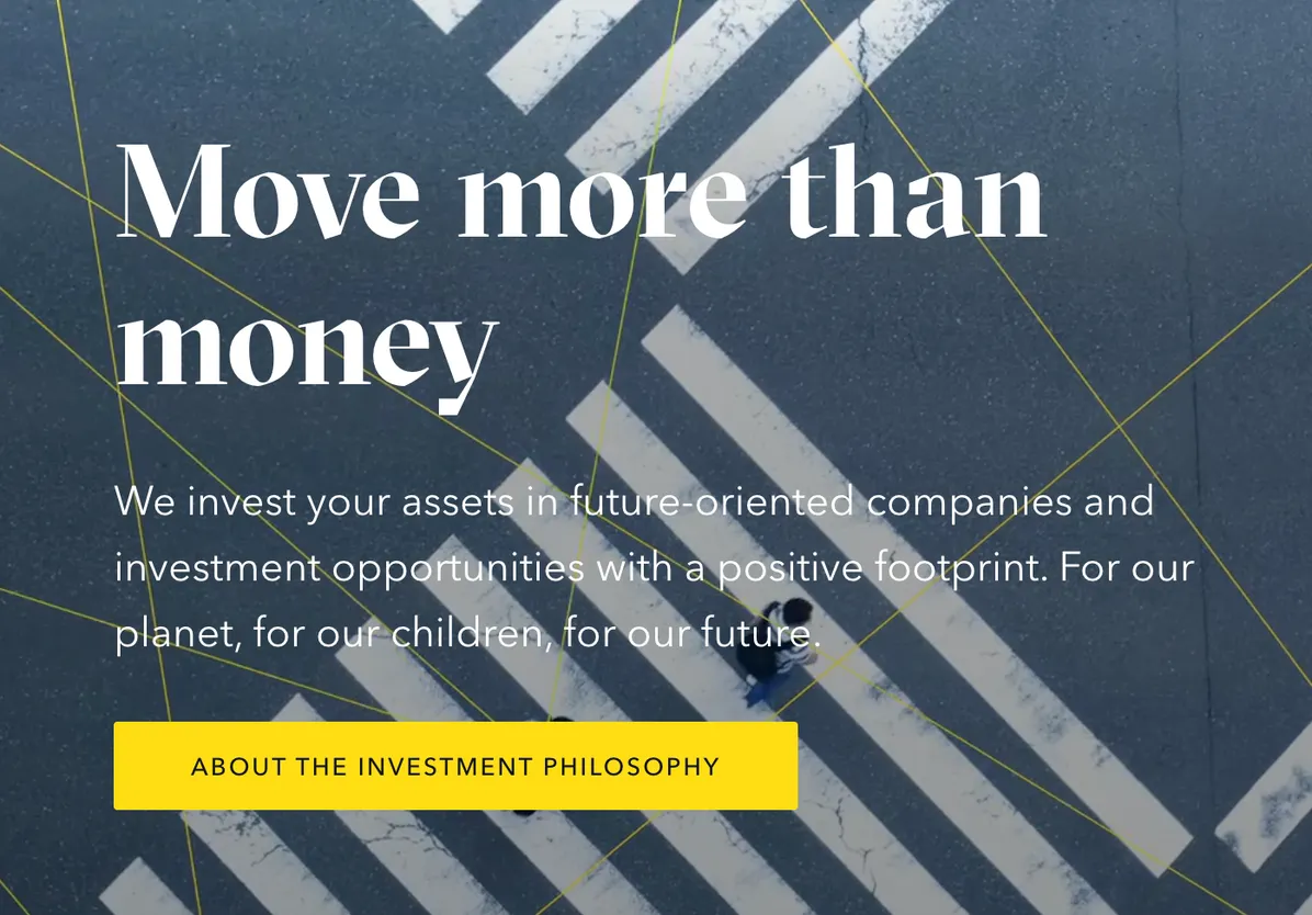

Two slides from one carousel, both live on the same day.
THE FINDING AT THIS STAGE
One company, one screen, and no rule deciding which of two institutions the pictures were describing.
02Misread
Interviews followed, inside the bank and outside it. What was said in them stays with the people who said it.
What is on this page is the run behind the homepage: twenty-four issues of the bank’s quarterly magazine, 2018 to 2026, and twenty-seven news articles published alongside them. The text was read for what the bank argues. The covers were read for what they show. Then each cover was put against its own issue.
The text moves. Early issues carry the environmental case as a cause. By 2022 sustainability is being argued on returns rather than on principle, and after that it is subordinated to capital, competition, and geopolitics. By spring 2026 the magazine is de-greening green subjects itself: cleantech framed as national security, and the phrase green is the new gold.
The covers do not move with it. From autumn 2023 they split into two registers and stay split. One is dark ground, gold and metal, system-scale subjects — a golden world map above a stage of small figures; a gold human-machine handshake. The other is green-nature and leisure — a vertical-forest building; a macro bee over an alpine meadow; the globe rendered as a tropical island with a palm and a beach umbrella.
The gaps are on the page rather than in the reading of it. Spring 2025 leads on AI tutoring, biotechnology, and changing values, and puts a bee on the cover. Summer 2025 asks how much wanderlust the planet can bear, answers with a beach postcard, and sets it beside the Best Swiss Private Bank badge. Spring 2026 — the issue the homepage is advertising — announces a race between the United States and China for chips, energy, and the moon, over an image led by wind turbines, rooftop solar, and a green Earth. The words say power. The picture says planet. A reader skimming takes the picture.
The split runs by season. Winter issues land the capital register; spring and summer drift green. On covers alone the bank reads as a capital allocator in winter and an eco-lifestyle brand in summer, and because it alternates, no reading accumulates.
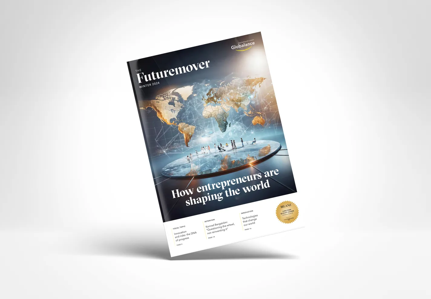
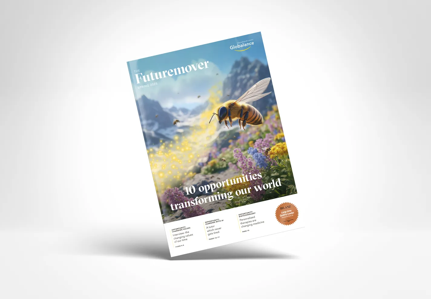
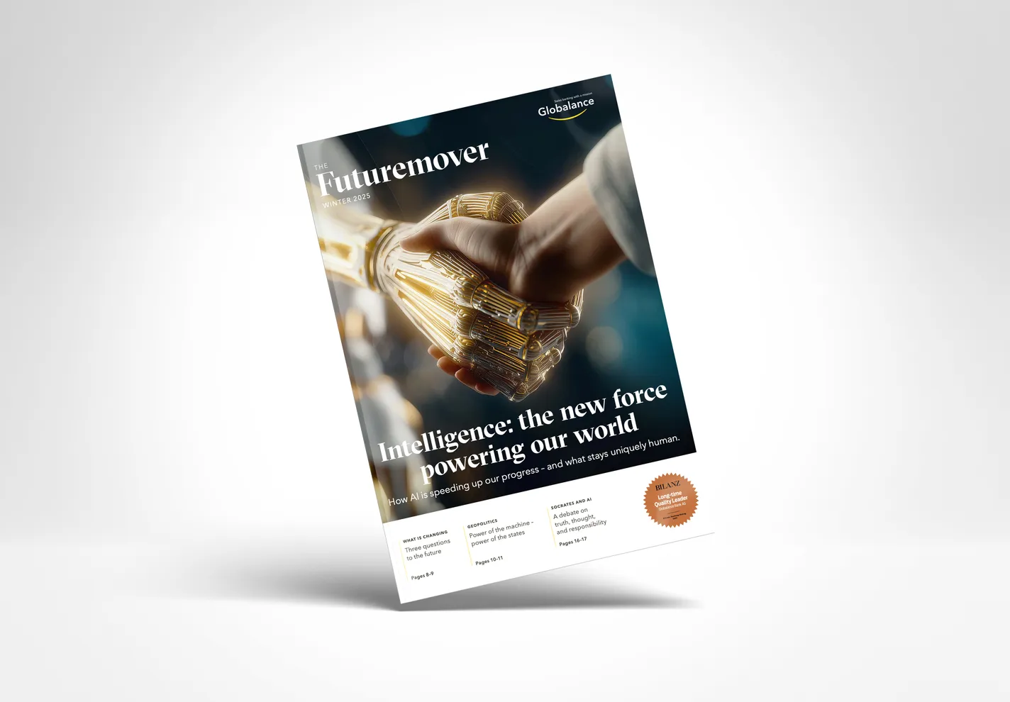
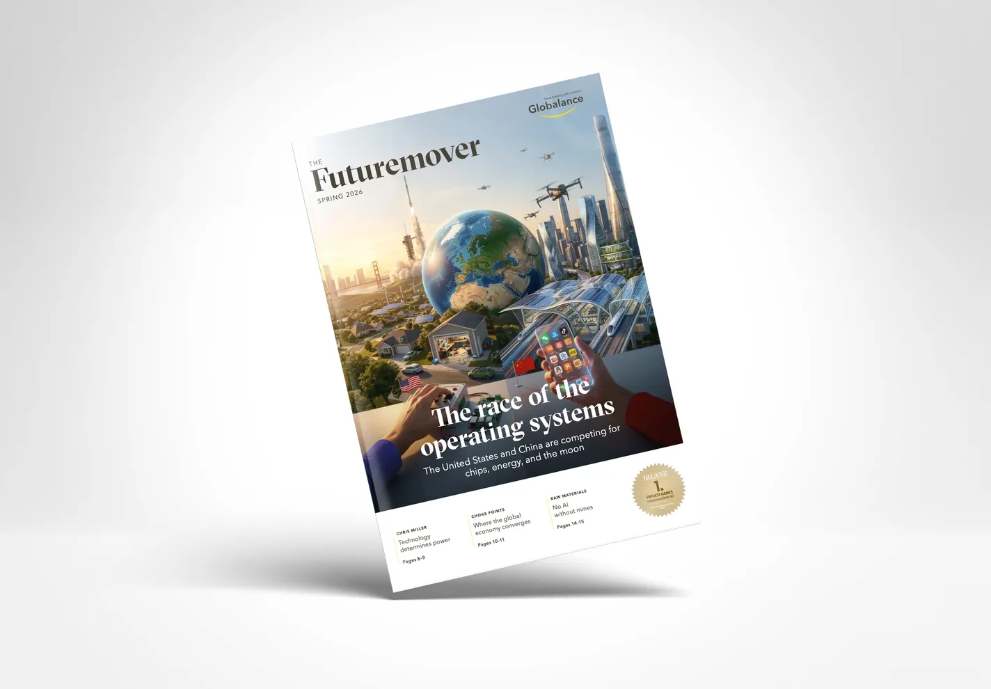
THE FINDING
An institution persistently read as an ESG and green vehicle rather than a serious capital allocator — with its own imagery the primary commercial driver of that read.
The origin was a lag. The argument moved between 2022 and 2023; the covers were redesigned in 2023 and moved the other way. Nothing was decided wrongly. No rule governed which register came out, and the pictures continued to follow the old argument.
What the engagement delivered was the strategic positioning and visual direction that followed: a register generalized from the bank’s own strongest covers rather than imported from anywhere, a second register for the publication interiors, and guardrails for generated imagery — the rule that had been missing. The bank adopted it as the foundation for its rebrand.